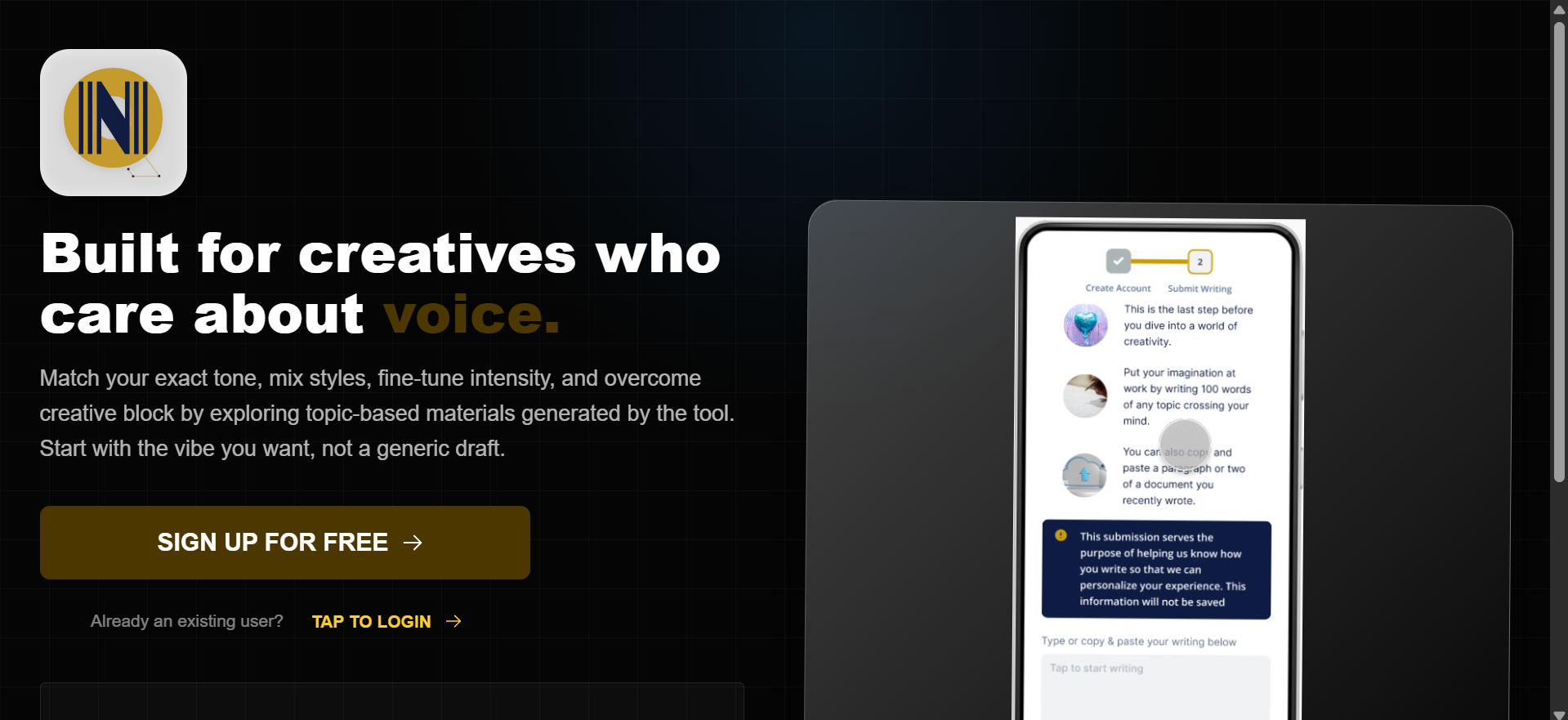
VoiceCraftAI: A Voice-Aware Content Engine
In an era of generic AI outputs, I engineered VoiceCraftAI, a custom AI content remixing and tone system that prioritizes intention over automation. This tool bridges the gap between raw generative power and human personality, allowing creatives to define specific tonal traits and emotional intensities. The result is a writing partner that doesn’t just generate text, it speaks with a curated, consistent voice.
|
Layer
|
Technologies
|
Purpose
|
|---|---|---|
|
User Interface |
React + Mantine UI |
A responsive, high-fidelity dashboard designed for complex user controls. |
|
Backend Logic |
Express.js + Node.js |
A robust backend architecture managing real-time AI requests and data flow. |
|
Intelligence |
OpenAI + Hugging Face + Zero-shot machine learning classifier |
Multi-model integration for high-level language processing and user tone analysis. |
|
Data Layer |
MongoDB |
A scalable NoSQL structure for managing users generated text and info for the personalization |
Understanding the Problem.
While modern AI has mastered clarity and structure, it often fails at identity. Through targeted user research, including mock interviews and empathy mapping, I uncovered a fundamental friction point: creators aren’t seeking more content; they are seeking their own voice. The challenge wasn’t a lack of productivity, but a lack of personality.
My research spanned a diverse cross-section of users, including content creators, educators, and accessibility advocates. By synthesizing their feedback, it became clear that the goal was to transform AI from a rigid editor into a flexible instrument that can be tuned to the user’s specific Creative DNA.
Friction Points Uncovered:
Defining the Solution Framework
After synthesizing the qualitative data from user documentation and empathy maps, the research converged into four critical dimensions. These served as the bais for both the user interface design and the backend AI logic.
Authentic Voice Preservation
The Need: Users required a system that could bypass the AI-default tone.
The Strategy: Engineering a model that prioritizes individual tonal traits over generic, formal structures to ensure the output remains true to the creator’s personality.
Frictionless Creative Flow
The Need: Overcoming creative blocks without sacrificing authenticity.
The Strategy: Designing a workflow that provides fresh angles and rapid ideation while keeping the user’s original intent at the center of the generation process.
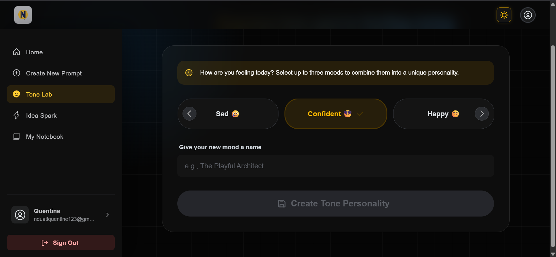
Granular Tone Orchestration
The Need: Moving beyond static presets like “Professional” or “Friendly.”
The Strategy: Developing a tonal blending interface that gives users control over emotional intensity and trait combinations, allowing for a truly personalized output.
Inclusive Usability & Accessibility
The Need: A tool that is usable by everyone, regardless of technical skill or physical ability.
The Strategy: Implementing strict WCAG accessibility standards, ensuring the interface is screen-reader friendly, and maintaining a minimalist, intuitive navigation structure.
Deepening the Connection:
Understanding the Creator’s Friction
Before architecting the system, I needed to dismantle the assumption that people simply needed more content. I focused on how different user types, from educators to accessibility-conscious creators interact with AI. My goal was to pinpoint exactly where the human-machine collaboration breaks down.
The Research Framework
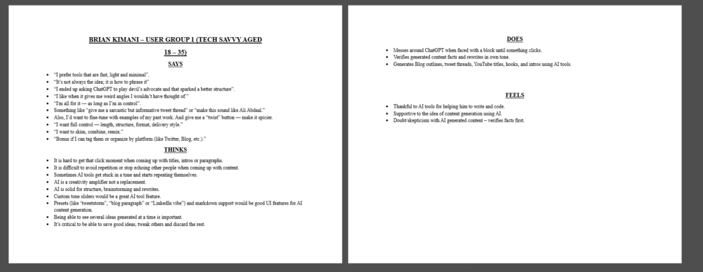
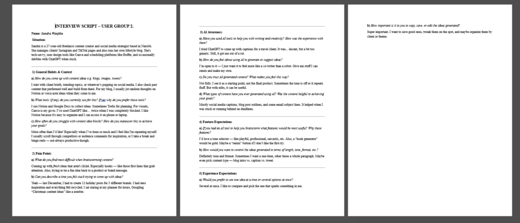
A Hybrid Methodology for Pattern Discovery To maximize efficiency without sacrificing depth, I conducted structured exploratory mock interviews using AI-assisted persona simulations. While synthetic, these sessions were grounded in observed real-world usage patterns. My objective was not statistical validation, but the discovery of behavioral patterns that inform engineering decisions.
Core Research Objectives:
Key Patterns Identified
Across user types, five recurring friction areas emerged:
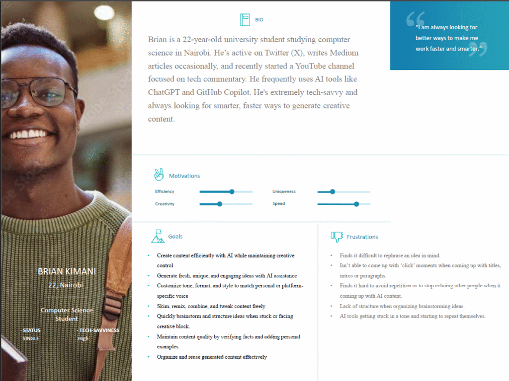
Starting Friction
“I had a sponsored post due, and I just didn’t know how to start it”.
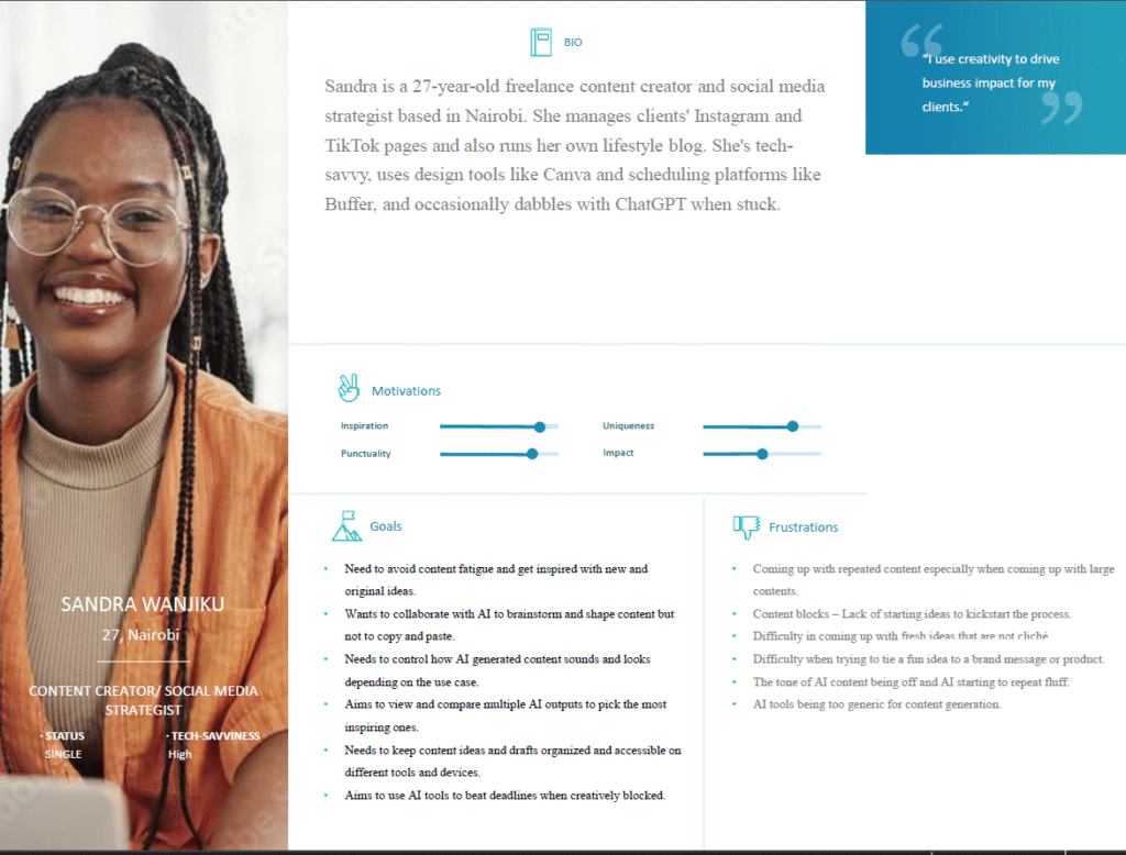
Loss of Originality
“Also, I don’t want to sound like 1,000 other creators using the same prompts.”
Tone Mismatch
“Sometimes the tone is off or it repeats fluff. But with edits, it can be useful.”
Structural Clarity
“It’s not always the idea; it is how to phrase it”
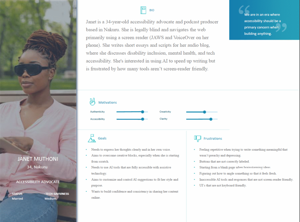
Accessibility Gaps
“A voice-based input system, something I can talk to and it writes down the idea. Also, something that reads the options aloud or lets me navigate easily with a keyboard or screen reader. And please, label all buttons correctly”
Visualizing the Research: Putting People First
Before I started building, I used a few specific tools to make sure I truly understood the people who would use this system. My goal was to move past my own assumptions and focus on their real-world needs.
The Define Phase: Turning Insights into Action
After looking at all the patterns from my research, I moved into the Defining the problem phase. My goal here was to take the frustrations I observed from the user research and turn them into clear goals for the product. I focused on five main areas that would guide every feature I built:
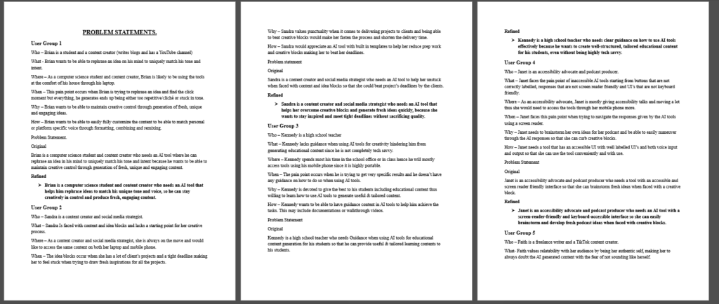
Problem Statements
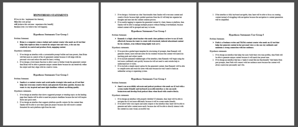
The Hypotheses: Defining the Solution
Before I wrote a single line of code, I developed a few “Hypotheses.” These were my predictions of how specific features would solve the problems I found during my research.
Personalized Voice Training
If users can create profiles based on their own writing, they will spend less time fixing robotic AI outputs.
Structured Remixing Controls
If users can adjust emotional depth via sliders, the content will feel more original and less like a generic template.
Multi-Media Inspiration
If the system provides feedback from videos, music, and blogs, it will bridge the gap between a blank page and a fresh idea.
Saved Tone Persistence
If users can store their custom tone settings for reuse, their content will remain consistently authentic and uniform across every project.
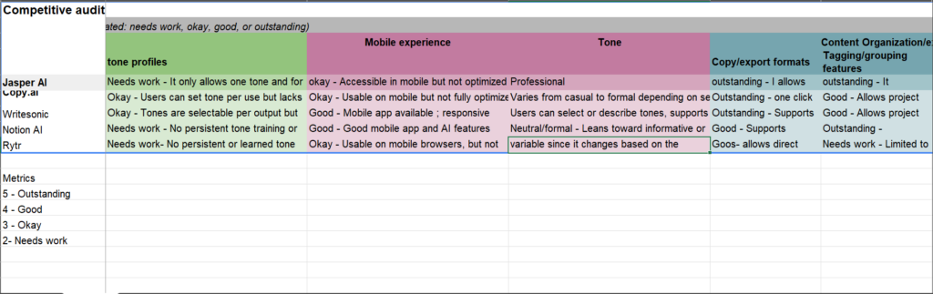
Competitive Audit: Finding the Opportunity
I analyzed existing AI writing tools to see how they handle personality and creative blocks. My goal was to identify where these platforms fall short, specifically in areas like tone customization, accessibility, and mobile-friendliness. This research helped me find the missing pieces in the market and focused my efforts on building features that truly set this project apart.
|
Competitor |
Strengths |
Improvement Areas |
Notable Features |
Opportunities for my solution |
|---|---|---|---|---|
|
Jasper AI |
|
|
Tone learning from user uploads. |
Simplify onboarding and reduce cognitive load for first-time AI users. |
|
Copy.AI |
|
|
Templates and workflows to guide users. |
Optimize for mobile-first creators who primarily generate content on the go. |
|
WriteSonic |
|
|
AI chatbot and guided templates for first time users. |
Implement adaptive tone learning that evolves based on user-generated samples rather than static dropdown presets. |
Value Proposition: Speed Without Sacrificing Authenticity
My platform is an adaptive AI writing system built for creators and educators who need to move fast without losing their unique voice. Unlike standard tools that produce generic, robotic text, this solution uses dynamic tone blending and multi-media inspiration to ensure every piece of content feels human, remains consistent, and stays accessible to everyone, on any device.
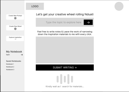
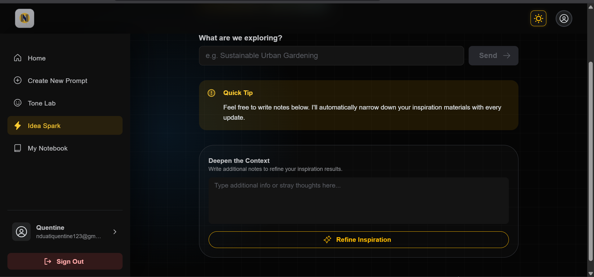
To ensure the platform solved the right problems, I documented every step of the strategic process. Explore the gallery below to see sample materials used in the problem and solution definition phase to bring the project to life.
Ideation: Asking the Right Questions
With the problems clearly defined, I moved into the Ideation Phase. To make sure my ideas stayed focused on real user needs, I used How Might We questions. This allowed me to explore a wide range of creative solutions while staying anchored to the goal of building a better AI experience.
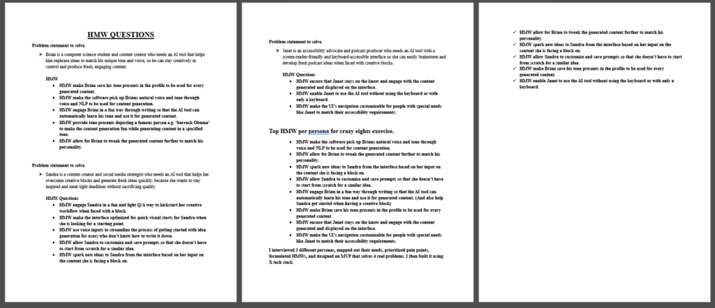
Key opportunity Areas & HMW Questions
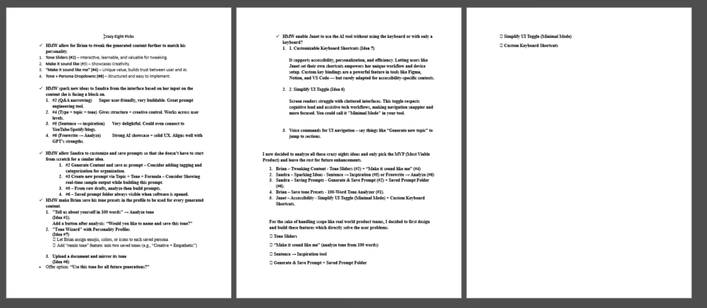
The Crazy Eights: Rapid Idea Generation
To push past the first, obvious ideas, I used the Crazy Eights method. I challenged myself to sketch eight different variations for every core problem I identified. In under 40 minutes, I generated 40 distinct concepts, including:
Through this rapid sketching, one specific direction stood out: Modular Tone Identities. Instead of choosing one static tone, I realized users should be able to blend, intensify, or remix different parts of their voice dynamically. This effectively turns voice into a controllable design system that the user can tune just like a musical instrument.
Shortlisting Concepts
Evaluating & Selecting the Solution
I didn’t want to build features just for the sake of it. I evaluated every idea against four key benchmarks to make sure the final product would be both high-impact and technically sound:
I selected five core features that balanced these criteria perfectly. These became the engine of the platform:
Selected Solution Directions
Moving from Concept to Testable Flows
With the roadmap defined and the logic validated, I moved into the Prototyping Phase. This was the moment I began translating my sketches into real, tangible interface elements. My focus shifted from what to build to how it should feel, ensuring every control felt intuitive and accessible for every user.
Explore the gallery below to see the transition from my early sketches and storyboards to the first digital blueprints of the system.
Design & Prototyping: Building the Interface
Once the direction was clear, I started designing with one main goal: Keep it simple. I wanted to take complex features, like AI tone controls, and turn them into a clean interface that helps users move faster, rather than slowing them down with too many options.
I approached the design in three steps: Structure (how it works), Identity (how it looks), and Validation (making sure it actually solves the problem).
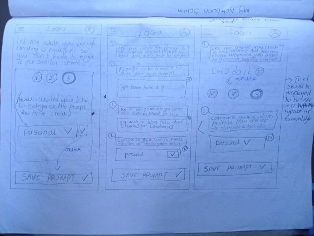
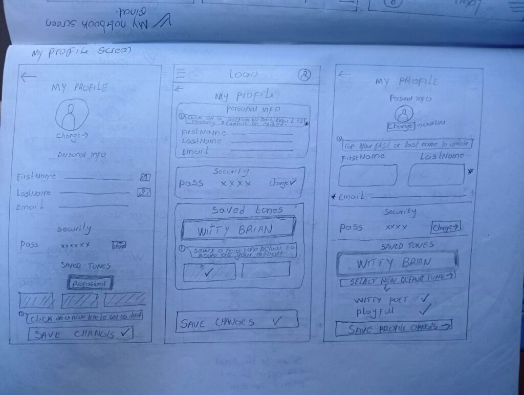
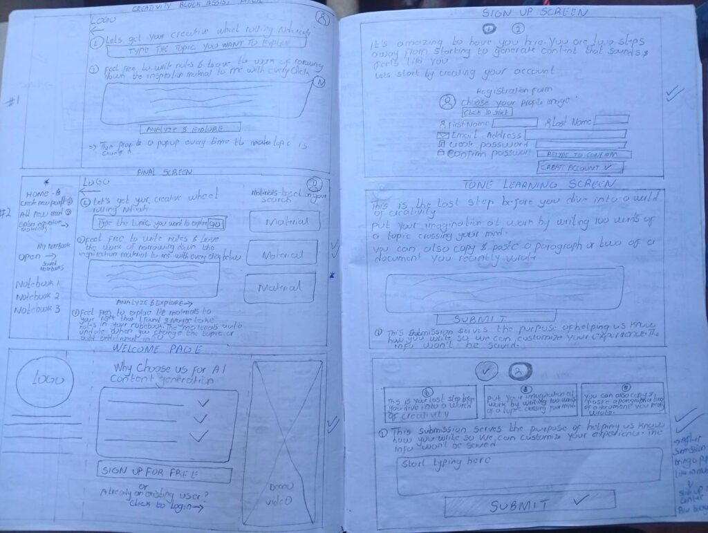
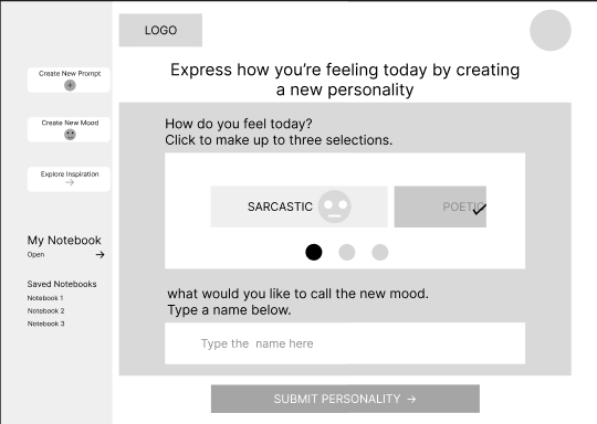
Low-Fidelity Wireframes: Testing the Flow
I started with Low-Fidelity wireframes to map out where everything should go. At this stage, I wasn’t worried about actual UI styling; I was focused on the user’s journey. My priorities were:
The Pivot: During early peer reviews, I noticed people were overwhelmed by too many buttons. I decided to restructure the flow around one dominant action, like “Generate” or “Save Tone.” This small change aimed to make the tool much faster and easier to use.
Exploring Layouts with Wireframes
Translating Structure into System
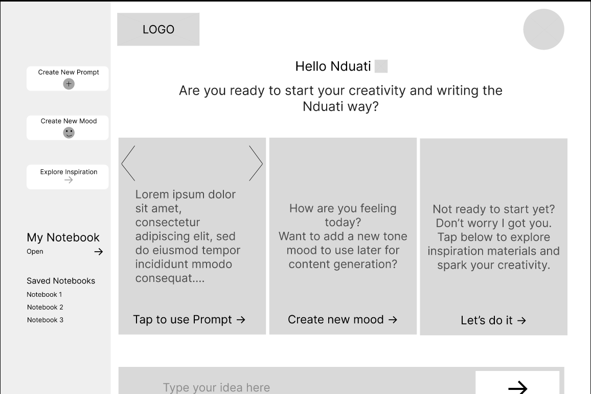
High-Fidelity Mockups: Polishing the Experience
Once the layout was solid, I moved into High-Fidelity Mockups. This is where I added the brand’s visual identity while making sure the tool remained easy to use and accessible for everyone. Key refinements I made included:
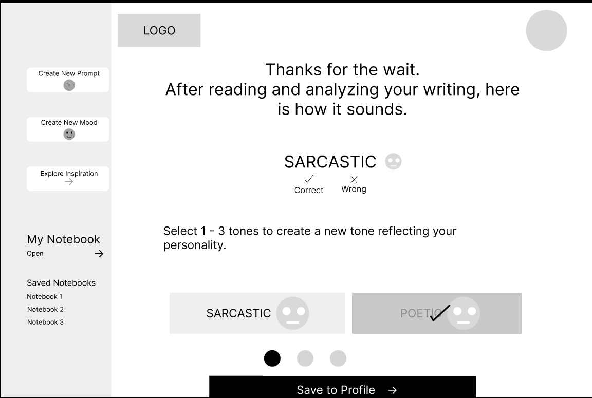
One of my biggest challenges was making the Tone Sliders feel powerful without looking like a complicated cockpit. To solve this, I used Progressive Disclosure:
The result is a professional interface that feels approachable for beginners but stays powerful for expert creators.
Before
After
Before
After
Before
After
Before
After
Validating the Flow Before Development
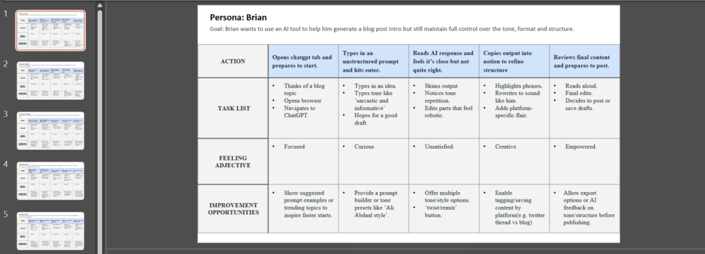
Interactive Prototype
Before writing any code, I built a fully clickable prototype to simulate the entire experience. This allowed me to test how real users would interact with the tool and identify any hurdles in the process.
What I tested:
Key Findings & Improvements
Testing the prototype with a few people revealed two main areas where I could make the tool even better:
By resolving these friction points before development, I reduced the risk of building unnecessary complexity into the final product.
The validated prototype provided a strong foundation for engineering handoff.
Feel free to interact with this prototype that mimicks the main user flow that the app aims to achieve.
Usability Validation: Refining the Experience
Before I wrote a single line of code, I wanted to ensure the interface actually solved the problems I identified. I conducted walkthrough sessions with peer creators to watch how they interacted with the prototype. My goal was simple: find the friction points before they became expensive coding mistakes.
The Testing Loop
I asked participants to complete the three most important tasks:
From Feedback to Fixes
I translated user feedback into specific UI enhancements. Each of these changes was built to reduce “friction” and make the system feel like a natural extension of the user’s workflow.
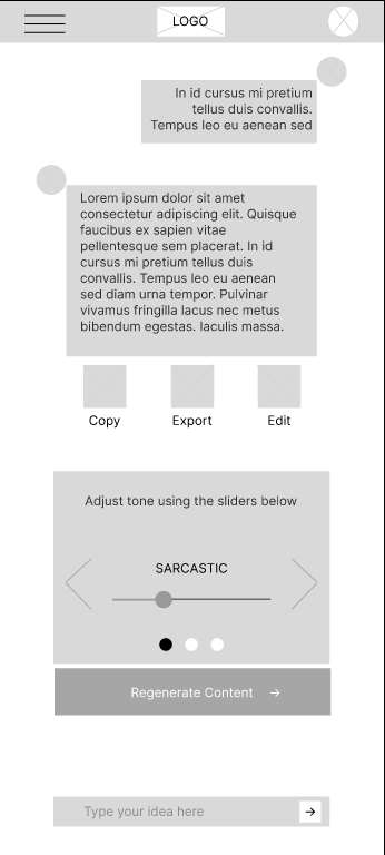
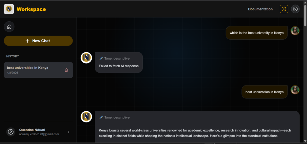
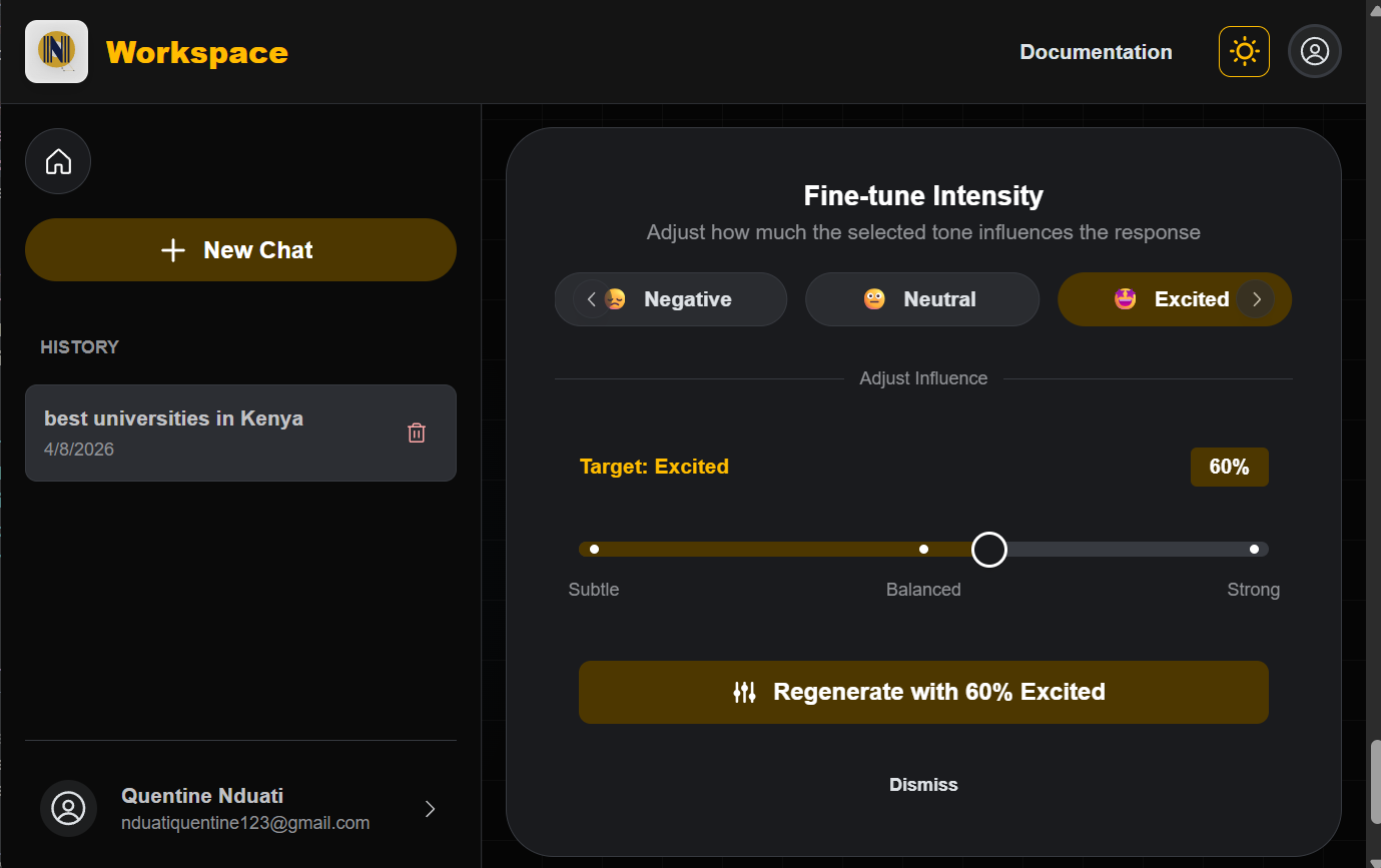
The Problem: Users felt tone remixing was a black box. They didn’t know if the AI would be “a little bit” or “extreme” in the content generation.
The Fix: Design the sliders to have discrete marks and real-time labels. This transformed an abstract concept into a physical control.
User Impact: Creators now have granular control, allowing them to “dial in” the exact amount of personality they want without guessing.
After
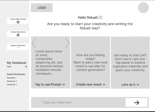
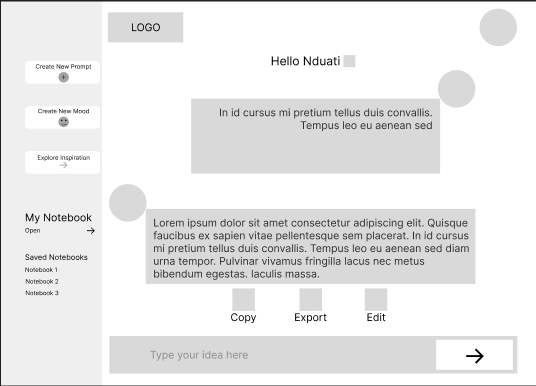
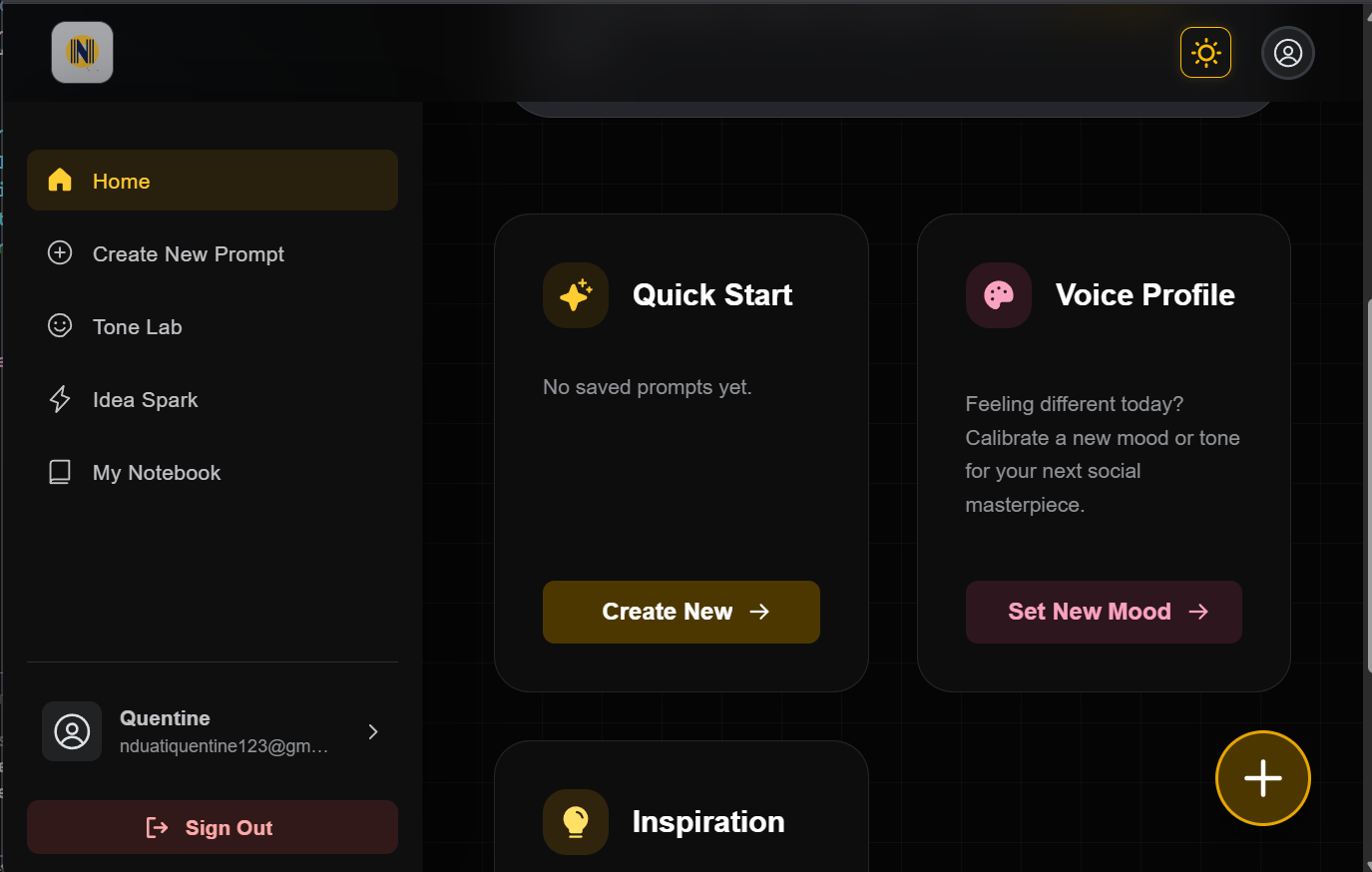
The Problem: Users found it tedious to navigate to a New Conversation and re-type their favorite prompts every time they opened the app.
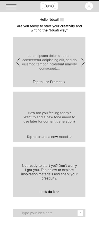
The Fix: I added a Saved Prompts Gallery directly to the main dashboard. Clicking a card instantly takes the user to the editor with their custom prompt pre-filled and ready to go.
User Impact: Increased user confidence and reduced repeated button presses (Reduced clicks & typing = Good UX).
After
Transition to Development: From Blueprint to Build
By identifying and fixing friction points in the design phase, I moved into development with full confidence in the product’s logic. This strategic approach ensured that every hour of engineering was spent building high-quality, refined interactions rather than fixing avoidable design flaws later in the process.
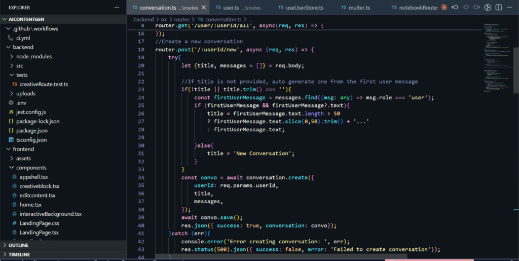
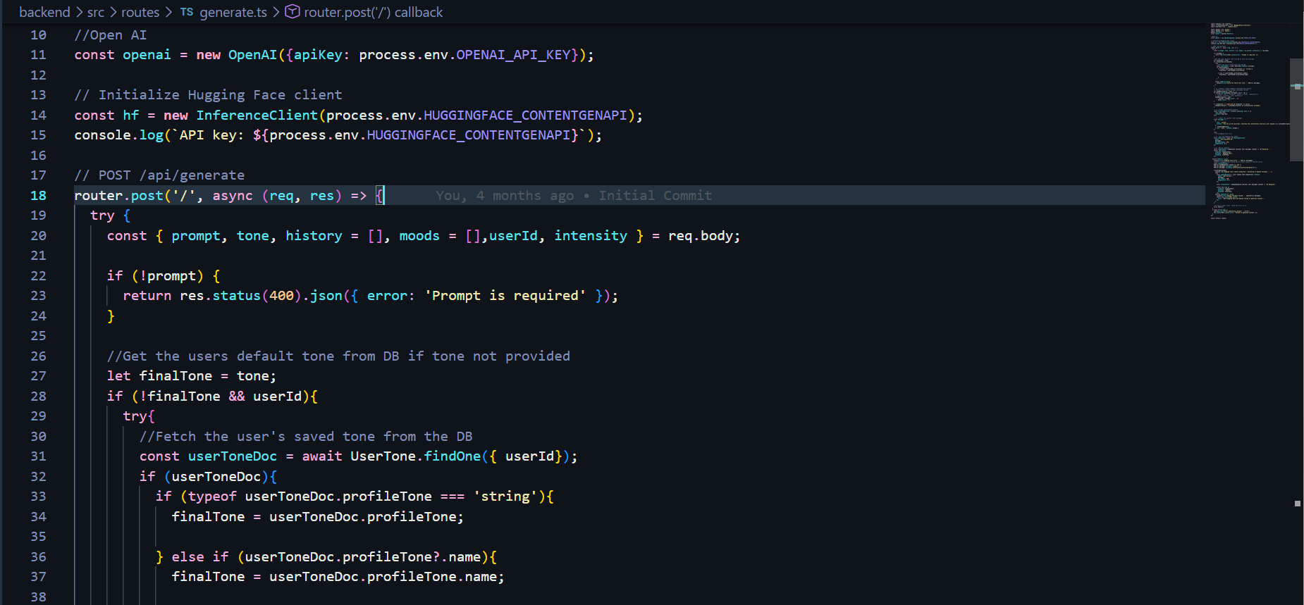
Development & Implementation
I moved into the engineering phase with a clear mission: to build a high-performance system that handles complex AI logic while remaining fast and reliable for the user. I focused on a modular architecture that could scale as the tool’s capabilities grew
The Technical Stack
I chose a modern, type-safe stack designed for speed and maintainability.
AI Architecture & Voice Personalization
The “magic” of the tool lies in its ability to mimic a user’s unique voice. I engineered a multi-layered pipeline to achieve this:
Engineering for Real-World Constraints
Great software isn’t just about features; it’s about how it handles limits. I focused on three key performance areas:
From Prototype to Product
The final phase was transforming a validated vision into a production-ready application. I deployed the frontend on Vercel for high-speed delivery and the backend on Render to ensure reliable, scalable API orchestration.
The result is a fully functional ecosystem where strategy, design, and engineering converge to solve the creator’s authenticity and blank page problem.
Users are now equipped with a professional-grade creative suite that allows them to:
Every line of code was written with the user in mind, ensuring that the product isn’t just functional, but truly serves the people using it.
Note on Performance: This application is currently hosted on a free-tier environment to support ongoing testing. Because the server “sleeps” during periods of inactivity, please expect an initial delay of about 3 minutes when you first register or log in. Once the system “wakes up,” all AI features and tone-analysis tools will be fully responsive for your session. Once you’ve explored the features, please return to this page and click here to navigate to the feedback form below to share your experience and any suggested improvements.
Beta Tester Feedback & Feature Requests
Great software isn’t built in a vacuum, it’s shaped by the people who use it. Whether you’ve noticed a small technical detail that could be improved, found a bug during the server wake-up phase, or have a big picture idea for a feature that would add massive value to your workflow, I want to hear it. This project is a living system, and your insights are the primary driver for its next set of updates.
Reflection & Next Steps
Reflection: The Bridge Between Code & User
This project reinforced that UX Engineering is a conversation, not just a task. By testing high-fidelity prototypes early, I avoided the developer’s trap of building features that look good on paper but feel clunky in practice.
The Challenge: Balancing the massive complexity of AI with the need for a simple, invisible interface.
The Lesson: Iteration is cheaper than a rewrite. Solving friction in Figma saved dozens of engineering hours and resulted in a product I am proud to ship.
Impact: Real Solutions for Real Creators
By focusing on the small wins, like the one-click prompt cards and visual tone sliders, the platform transformed from a basic AI wrapper into a true creative assistant.
Efficiency: Users reported potential of significant reduction in “blank page syndrome.”
Authenticity: The Zero-Shot Classifier ensured that the AI didn’t just write; it wrote like them.
Validation: Seeing a user starting the journey from navigation, content generation, tone refinement and saving in their computers/phones confirmed that my design and engineering choices were aligned with real human needs.
The Road Ahead: Future Iterations
While the platform is live for testing and feedback, a great engineer is always looking for the next optimization. My roadmap for future versions includes:
Deep Personalization: Expanding the tone classification to include sentence-structure analysis and vocabulary mirroring.
Model Orchestration: Implementing a Switchable Core to allow users to toggle between different LLMs for varied creative perspectives.
Creator Analytics: Adding a dashboard to track which generated tones perform best on social platforms, closing the loop between creation and performance.